
 |
| Kerry Cliffs Yay! I'm mostly done with the quilt top now. I need to add rocks in the water at the bottom left and I still have to fuse everything down, but the bulk of this landscape is done. Whew! |
 |
| Some of my cliff fabrics |
I thought it would be helpful for you to see some of the fabrics I used making the cliffs and rocks. I used the front and the back side of a few of these fabrics and I used a few markers and a little light crayon.
The fabrics with striations worked wonderfully for portions of the cliffs. There was a question or 2 about how I'm doing this, so here is a step by step so you can figure it out.
I'm going to build the bluff on the upper left.
The fabrics with striations worked wonderfully for portions of the cliffs. There was a question or 2 about how I'm doing this, so here is a step by step so you can figure it out.
I'm going to build the bluff on the upper left.
 |
| Upper left green bluff - it will have rocks and water in this pattern piece. I chose the wrong side of a mottled green print to form the basis of the distant bluff. First I cut out my freezer paper pattern (see last blog). I pressed it to the right side of my fabric - which is in actuality the wrong side of the print. |
 |
| I cut out the distant bluff shape from the green fabric. |
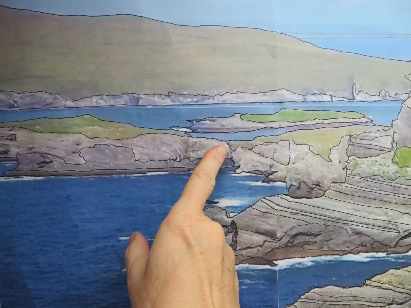
Now, I'll start at the bottom and work my way up. The very bottom is shore line. I compare the freezer paper shape to the shape I have on the poster size image of my photograph. (See last blog).
 |
| My freezer paper pattern pressed to the green print foundation |
I'm starting with the area to the right of my finger -
 |
| Shapes on the freezer paper and the photo guides the colors and prints I choose. |
 |
| The first piece |
I've cut out the freezer paper - the first piece. It's part of the shoreline so I find the fabric I want and press the paper to the right side of the prepared fabric. (This fabric has a paper backed fusible web on the back; either Wonder Under or Steam/Seam Lite.)
 |
| The freezer paper is your template so cut out that shape |
 |
| The shoreline piece |
Peel off the paper from the back of the fabric, arrange it on the green/foundation and fuse it in place.
 |
| Fuse the shape to the green foundation |
Not EVERY piece needs to get cut out individually. This next piece has a slightly gray triangular area in the upper left. I'm not going to bother cutting out a slightly darker gray for that area. When you see this piece on the photo below you can see that it is just a bit darker .

 |
| The triangular shape from my poster/photo |
 |
| First, I cut out the shape and choose a gray rock print |
The rock print is prepared with a paper backed fusible web. I don't press fusibles to most of my fabrics until I'm sure they will work - I press them on as I go.
 |
| Fuse on freezer paper pattern and then cut it out and fuse it to the green foundation. |
 |
| The rocky coast is in place |
Once the gray is fused on the green print foundation I cut out the slightly grayer portion of the freezer paper, hold the remainder of the pattern in place and lightly color that portion darker with my marker.
 |
| Done with the gray |
Time for the next piece of fabric - this will be green mossy grass stuff -
 |
| I continued to build the landscape bit by bit |
 |
| Work is continuing |
 |
| All done - |
Once I finished with the distant hills I put everything together to see how it looks. This is always fun as I see all the sections together for the first time.
I hate the sky.
 |
| Blotchy Blotchy Blotchy Sky |
I'm sorry the colors are off on some of my photos. I've been taking pics as I go with my cell phone which captures great details but the color is wrong. I have a mid range digital camera but it doesn't capture detail as well... it does a bit better with color.
Anyway, sky prints run salvage to salvage meaning that if I found the perfect sky print I still couldn't use it because it would only be 44" wide and this quilt is over 60 inches.
One other thing to keep track of is that the sky needs to be in the same color range as the water. The two have to blend to look natural. (Unless it is an aqua blue glacier fed lake.)
One other thing to keep track of is that the sky needs to be in the same color range as the water. The two have to blend to look natural. (Unless it is an aqua blue glacier fed lake.)
 |
| The distant water and this sky print looked pretty good together after I painted the water a bit. |
I bought some Inktense Color Blocks from Blick Art Supplies and I love them. I've never used them before but they were easy to use and there are a lot of you-tube videos showing you how you can apply them to fabric.
What you see below is the water print I chose for this landscape. If you look close you can see a 2 inch strip that is a little different in color - it's about half way down.
What you see below is the water print I chose for this landscape. If you look close you can see a 2 inch strip that is a little different in color - it's about half way down.
 |
| Water print |
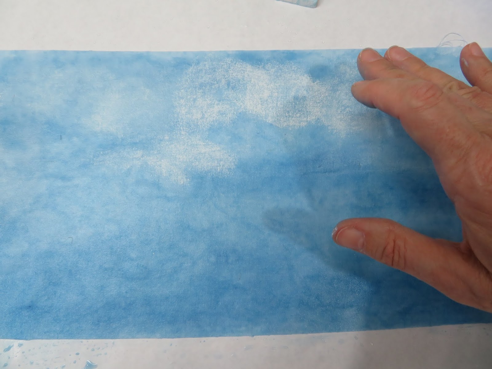
The water print was pretty gray so for the strip of distant water I just wet it down and lightly painted it with a bit of aqua blue color. This color is translucent so the texture of the water comes through it wonderfully.
 |
| My paint set up - that portion of painted fabric that you see here is from the bottom of the landscape where the see is darker and it is also wet so it looks even darker still. |
These are the colors I bought from Blick. I didn't buy sets, just individual colors and made little color charts to keep track of which colors go with which blocks.
I painted the water. Under the fabric is freezer paper to protect the surface of my table from turning blue. I put the freezer paper plastic side UP so it stayed smooth and kept the blue water paint from seeping through.
To start I thoroughly misted down my fabric. It was wet. Then I put a little water in my paint cups and mashed the end of a color block in the water. I also used a wet brush to brush off the end so I could get paint into the water that way.
Then using a good size paint brush I painted color onto the water print. I used several different blues and if the blue went on too strongly I misted more water on it to dilute it.
I also kept the darker blues from the edges near the shoreline and I used a white color block to make those areas lighter still.
Here is the top portion of the ocean - under the green bluff I just made - and you can see the before and after pics of the painted fabric.
I also kept the darker blues from the edges near the shoreline and I used a white color block to make those areas lighter still.
Here is the top portion of the ocean - under the green bluff I just made - and you can see the before and after pics of the painted fabric.
 |
| Before and after |
Remember, I hated that sky print... so I found another. This was just a mottled light blue print and I used the same colors on it that I did in the water so they blended. I was a little nervous about all this because I've never painted before. I made the cloud shapes by using the flat of the white color block on wet fabric and then lightly smoothing it out with my finger in a circular motion.
 |
| Making clouds |
 |
| The fabric is drying now and looks a bit darker than it will be once it's dry |
In case you are wondering what those darker hill shapes are at the bottom of the sky it's the Dingle Peninsula. On a clear day you can see the bluff shapes of the cliffs there across the Atlantic ocean.
 |
| That water looks pretty good!! |
I've never painted before and it was instant gratification time when I put cliffs on top!
 |
| Done with the water and sky! |
The last couple of weeks I've been working on the foreground hill and the white cap waves. I used a white Inktense block and bold swirly strokes to make the white water. (See below.)
The foreground hill gave me some stress because none of my landscape prints looked quite right cut out and appliqued. In the end, I used some of my grasses and yellow flowers but decided to make my own heather using confetti.
The foreground hill gave me some stress because none of my landscape prints looked quite right cut out and appliqued. In the end, I used some of my grasses and yellow flowers but decided to make my own heather using confetti.
 |
| The work so far |
If you go back to my last blog to see my inspirational photo you'll see that the heather was pretty brown. We visited the cliffs in September and missed the blooming season but I wanted a bit of the pretty color so I improvised and made some the bits of confetti out of brown and gold and some out of rose colors. I also used some brown and gold markers on the grasses in the foreground. The yellow flowers are gorse bushes. (If you want to look at some serious eye candy use google images for heather and gorse - the colors are so pretty together.)
Actually, I think I'll show you more precisely how I made this foreground in my next blog. I think I took pictures of the process, lol. I remember I slightly changed the base gold meadow print to a green color with paint, too... hmm, better go back and look at my cell phone pics!
And that's it for me.
Comments welcome!
And that's it for me.
Comments welcome!
Hello Cathy, just took a look and your wonderful blog/tutorial on your cliffs. It is actually amazing how you put it all together. Very impressed. I like this format, who knows I might start considering making some nice pieces too! Thank you for sharing your project. Julie
ReplyDeleteThanks Julie!
DeleteLove watching the progress on the beautiful cliffs!
ReplyDeleteThanks! They were beautiful cliff and they aren't part of a state park or county park system. If it hadn't been for Rick Steves's Guide to Ireland we would have missed them. They were incredible!
DeleteI love your work and am enthralled to be able to learn the details of your process! Thank you.
ReplyDeleteThanks Hippie!
Delete