
 |
| Zion Narrows |
I wasn't planning on making another quilt so soon, in fact if you looked at my last blog I think I said I wouldn't be making another quilt so soon - I wanted to work in my yard and walk my dogs and enjoy spring. Well, winter came back and just dumped another 5 inches of snow so as I was stuck inside I figured I'd make a landscape.
I also wanted to do something completely different.
I also wanted to do something completely different.
The photo above is a shot I took a few years ago when hubby and I hiked up the Narrows in Zion National Park. You know how I made Gene Kelly in Gotta Dance? (By the way I just won a 1st Place ribbon on it at MQX New England!!!! I was THRILLED.) I also made Mary Poppins in a similar way - I made freezer paper patterns of them from photos and used those patterns to create the figures.
Long story short - I thought "why don't I try doing this with a landscape?"
So I am.
I started with the photo above but didn't like that middle area where there was too much beige beach sand area in front of the small tree on the left. I chopped it out and came up with this changed photograph.
 |
| New and Improved photo |
It was a high resolution photo so I converted it to a pdf file and printed it out as a poster. I think it printed out like 14 sheets of paper or something. I taped the pages together.
 |
| My poster/photo and a little one to have on hand just because... |
The next step was to tape it to my light box, ie. my sliding glass door and trace the thing on freezer paper.
 |
| 15 pages of pattern on my door |
It took me a couple of days to finish tracing all the shapes in this landscape. I didn't bother tracing the tree because I knew I'd be adding it in after the landscape was pieced together.
 |
| A bit of my pattern |
Here is the pattern and the poster on the floor in my sewing room. (Notice how clean the floor is around it, lol. That will change!!! I'm a mess maker when on a roll.)
 |
| The landscape should be about 31 x 40 inches |
 |
| Close-up of my pattern |
I pinned my poster onto a small design wall thingy and propped it up in my work space and began to pull fabrics from my stash.
 |
| Fabrics and poster |
I'm building this landscape on Pellon EK130 foundation. It is a tricot knit interfacing which has a fusible on one side. I found a large board, put the foundation on it and placed my pattern over the foundation. The foundation only comes 20 inches wide so I have a long strip of Wonder Under holding two sections together.
 |
| Foundation and pattern |
It's kind of fun that there is a face on the pattern, but that won't show up once the quilt top is done. The shading is wrong and there will be a tree in front. But still, it was kind of fun - do you see the face? It's on the right in a profile.
 |
| Starting in the center |
I decided to start in the center because if there are any shifts in the way the landscape is put together the shifts won't be off that much... you'll see what I mean as I go.
In the photo below you can see the first golden rock face in my canyon. You can also see some of the fabrics I used to make it and you can see crayons and markers that I used to subtly change colors to make them more dynamic.
That white marker is invaluable! You find them in the scrap booking sections of craft stores like Michael's or Hobby Lobby. I use it a lot! I can make a whole patch lighter and then use a marker or crayon to change the color on top of the white ink. I use it to blend in darker fabrics by lightening the edges of the patches so they blend in more with the surrounding prints.
 |
| Some of the fabrics I used to make the golden wall |
Here is a closeup of the wall -
 |
| Close- up |
Let me explain a bit of how I'm doing this. I started by cutting out one large rock formation from the freezer paper pattern and picking one print which will be the base for all the rest of the patches. I choose this print based on a couple of things; first the value of the print - it should be a medium value, and second - that print should look natural in the background of all the other patches. Not EVERY patch that I drew from my pattern needs to be cut out and fused to this background print so it's easiest of the print has some natural movement and flexibility... ie. does it have a mix of values? Does the print have an annoying repeat? Does the print have lighter and darker portions that I can cut out? I found the perfect batik base for that rock wall. A golden one with shadowed areas. (It's pictured on the right 2 photos up.)
 |
| Dark rock face |
Above you can see my larger freezer paper pattern and how I cut out a base fabric. The fabric was pretty much tone on tone so I used my trusty white marker and brown and black ones to add more color. It was pretty dark fabric so first I lightened it with lots of streaks of white and then I went over the white with brown marker. I mimicked the striations on that patch of fabric that you can see in the poster/photograph.
You can see that the bottom of that larger freezer paper pattern has another shape I need to cut out to create the right shading. So, I cut it out.
You can see that the bottom of that larger freezer paper pattern has another shape I need to cut out to create the right shading. So, I cut it out.
 |
| Shape at the bottom of that dark bluff |
Once I cut out a shape I back it with Wonder Under and fuse it in place. Let's look at a big canyon wall now -
 |
| The BIG one |
So, the biggest rock face was made from a blackish charcoal batik. Here it is - notice it has some lightish areas and some darker ones. Oh, you can also see all the shading/highlighting I did with my white marker on the left side of the dark wall.
 |
| Rock face base |
Below you can see that I began to cut this freezer paper pattern out by cutting the long dark shadow - this patch will be black. By keeping the uncut portions of the freezer paper pattern in place, I know exactly where to place each small patch that I cut out.
 |
| First patch will be added in the empty space |
 |
| Next rock shape |
I continued to cut out and fill in that rock face with other prints. If you go back up to the poster/photo you'll see that this dark bluff had some browns in it, also most of this lower part of the bluff was behind the tree so I just guessed a bit and added color and texture. I did not want to leave the fabric here plain even though I knew a tree was going to go here. Why? Because I don't want to back myself into a corner. Perhaps when I got to the tree I wouldn't want it to be so big? If that would be the case, I'd be stuck because I'd left that rock face undone.
The rock face on the lower right (above) was the wrong side of a gray bark print by the way. I worked on it in a hotel room in Iowa and didn't take any pictures of my progress but you'll see the final product at the end of my blog here.
Anyway, let's start on a tricky part. That blue/gray rock on the upper left.
 |
| Another day another rock! |
To show you more detail about how I'm doing this, let me remind you of the rock face I'm making -
 |
| Gads this looked a little intimidating when I started! |
It's a blue/gray, it is shaded on one side more than the other, it has tones of reds and browns here and there and it looks cracked. YIKES!
Taking this one step at a time, I decided my base would be this textured ombre print - it has natural shading and a somewhat craggy texture. (I think I lucked out actually!!)
When I go shopping for fabric for my stash, I buy lots of 1/4 yard pieces. All these prints in my stash have enabled me to pull off this landscape so far. I've been quilting for nearly 30 years making landscapes in different styles so I have many prints to choose from these days.
 |
| Base fabric |
I folded it over and put it in place to double check that this print would work. It will.
 |
| Yep, that is about right. |
 |
| Cutting out the base fabric |
I positioned the pattern such that the left side of my rock face was more in shadow than the right side.
 |
| Cut out base- with a bit to spare |
When I cut out the base prints I usually add 1/4 to 1/8 inch extra to the edges because they will need to overlap a bit with the other major formations in the pattern. I also wrote a bit about the colors on the pattern so I kind of knew what color needed to go where. Sometimes it gets hard to keep track of where you are in the pattern/photo as you cut up the freezer paper.
 |
| The base again |
From the poster/photo you can see that there are some gray granity portions running down this rock face. I chose a Stonehenge granite to make those patches. Notice how incredibly different the textures are from the base to the granite print.
 |
| Two fabrics side by side |
So, here is my messy stained working place with the pattern and three portions that I cut out from the stonehenge print.
 |
| This mess is on my cutting board, but if it was a nice white cover it wouldn't be for long! |
The granite looked like this - remember, I use the larger uncut portion of the freezer paper to show me where to place the small cut out patches. These small patches are fused on.
 |
| Fused patches |
 |
| Patch work |
In the photo above, there are 2 granite patches. The top one is plain and the one underneath is one that I touched up using my white marker and a bit of blue crayon. Look at the difference. I used the white on the outside and made whitish blob shapes here and there on the inside. Then I went over them with a blue crayon and heat set the crayon with a hot iron.
That little dark slip of rock on the right was created in a similar way only I used orange, blue, brown, etc. To tell you the truth, I just kept at it until it looked right.
That little dark slip of rock on the right was created in a similar way only I used orange, blue, brown, etc. To tell you the truth, I just kept at it until it looked right.
 |
| So far... |
Putting the rock back on my board I added other patches using white and gray as needed. I brought in some red batiks, some mottled light gray prints, and then I used crayons to bring in more shading. I used a lot of the white marker to highlight and blend.
 |
| In progress |
I'm working from the top down; here is what I have so far - you can see the gray, the purple, where I've used the white, etc. Because I made a pattern of the shapes and colors, I can place these patches exactly where they need to go so my rock will look like the photo.
 |
| Working on down the rock |
Below is the finished rock - whew!
 |
| All done! |
 |
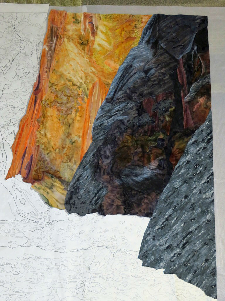
| The canyon so far |
This is about where I am in building this landscape. Oh - you can see the finished rock on the bottom right now. I'm very pleased with the way the landscape is going! I've never done anything like this before and I've discovered that it is a lot of fun! It's challenging, it's step by step slow, but the results are pretty cool if you ask me.
 |
| Close-up of the blue/gray rock face and the golden wall |
If you look closely at the above photo you can see how I used the white marker to blend in the portion of the granite on the golden wall. You can also see how I cut small patches from the same light batik to create the illusion of light shining down on the upper middle portion of the golden wall. As much as I possible can, I'm following my pattern and the photograph.
 |
| Starting work on the upper left |
There is pretty intense color on the upper left and I'm hopeful that I can make this amber print work as a base. The last rock wall on the left might be the hardest one? I don't know... I'll cross that bridge when I get to it. I was up in the night wondering about what I can use as a base when the color from top to bottom in the rock wall is so different.
Time to get back to it. Zion is an amazing gorgeous park but it is very very crowded and they are having to turn people away at times now because there is no place for them to park their cars and the shuttle buses are filled. Hiking through the water up the narrows was one of the best experiences I've ever had in our parks and I'm happy to be able to make a landscape to reflect all the beauty we saw sloshing our way up the canyon.
Happy Quilting Everyone!
(Comments/questions welcome)
Your talent amazes me!!!
ReplyDeleteThank you Claudette!
DeleteThank you for all your narration. I’m trying to finish a landscape I started 2 years ago and this blog gave me the kick I need to finish it. Also I just left the “National Quilt Museum” in Paducah and saw your Mary Poppins quilt. Your blog pictures didn’t do it justice. It is stunning. Thank you for being such a caring and sharing artist.
ReplyDeleteThank you! I wish I could have seen her flying at the National Quilt Museum this spring. RATS!
DeleteI'm glad you liked the blog and I hope you have some fun finishing the landscape. I've done a couple in the past that I didn't like and never finished. These are tucked away in a box in a back cupboard never to see the light of day, lol. I'm glad you liked Mary and thanks for telling me about her. :)
I am amazed by your talent and your patience! This will be a master piece when finished. I have started a landscape quilt and I'm struggling... Looking at yours will help me not to give up! And thank you so much for sharing your knowledge!
ReplyDeleteThank you. It's been a lot of fun so far - I'm actually finding it easier than using strips because what you see it what you get and it's fun figuring out the best ways to change the colors slightly and blend everything, etc.
DeleteI have a huge collection of fabrics so that makes it easier for me I think. I hope you can finish yours and be happy with it!
Wonderful!
ReplyDeleteThanks!!
DeleteBeautiful!! Can you give details on that white marker? Also...when you heat set crayons, do you use steam or a dry iron? I assume you need a pressing cloth.:)
ReplyDeleteI'm too lazy to use a press cloth... but I probably should have. The crayons MUST be heat set. I use a dry iron that has a non stick coating on it and I haven't had any trouble with it getting dirty. The fabric is a bit stiff when I'm done and that could be because the wax is in it? I've never done this before and probably should have googled it or something!
DeleteThe markers are found in the scrap booking section of Michael's and Hobby Lobby. They are 'fine' points and I thought I put a photo of them in the blog before this one. They are around $3 or so I think. I'm pretty sure I did add a photo in the last blog before this one.
One thing I figured out though about using the crayons, you should probably have a fan going or use them in a well ventilated room. Apparently the fumes can get to you. ALSO, if you want the crayon color to go on really thick, heat the fabric with an iron first and then swipe with the crayon - they melt easily. This way means they don't blend into other colors as easily, but if you need a more intense color, that is the way to do it. I also discovered that if you use enough white crayon you can lighten the fabric a bit - but you've got to use like 1/2 the crayon! (Markers are easier.)
Hope this helps!
Thanks so much for the additional information, Cathy! Your work is phenomenal!
DeleteYour landscapes are beautiful. I am fascinated by how you drew your pattern for the canyons. I would love to have been a fly on the wall while you were copying it onto the freezer paper. And how you deciphered the color scheme with crayons. Does your book which is on my list to purchase go over this technique?
ReplyDeleteHi June, I just traced around the features in the photograph and followed the photograph when I chose colors. In hindsight, it would have been better to outline the major features ON the photo/poster before I traced them out. Now I know!
DeleteThere is nothing about crayons in my book... this thing using them is the first time I've used them aside from drawing saplings on a whole cloth background. If you look at the links on the purple bar at the top of my blog, you'll see something like "Preview Cathy's book" or the like. That page has more about what you'll see inside it - it's pretty much only using strips to create landscapes. :)
I am trying to learn landscape quilting (with a focus on old abandoned barns) and found your discussion of your techniques here to be so valuable. Thank you for taking the time to tell us how you did it - and to share so many photos of the process. Wish I could be a fly on the wall in your studio!
ReplyDeleteYou're welcome, I'm glad I could help. I've made barns using the watercolor technique - which is piecing squares and triangles of fabric, and barns using strips. Mine were red though. I think old abandoned ones with all that rotting wood texture would be really cool to try out. :)
DeleteI hope you do try an old barn - I find them endlessly fascinating. Definitely a learning curve to make them though!
Delete